

“How is it different from a bar graph?”
“How do you read a histogram?”
“How is it actually used in manufacturing?”
This article is for those who have these questions. We will explain it clearly and concisely so that you can understand it in just 10 minutes.
By introducing examples of its application in manufacturing, we will help you grasp how to interpret histograms and apply them to real work situations.
Additionally, we have provided detailed step-by-step instructions on how to create histograms in both Excel 2013 and earlier versions, as well as Excel 2016 and later versions. We hope you’ll read to the end and find it useful!
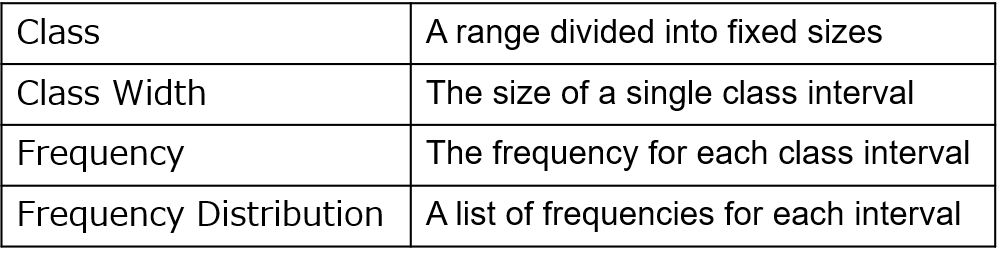
What is a Histogram?
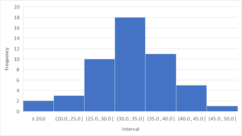
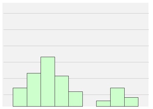
Histogram is a statistical graph that represents frequency on the vertical axis and class intervals on the horizontal axis.
It divides data into intervals and visually represents the frequency of each interval (a frequency distribution table). Below are examples of histograms and definitions of related terms.
Although histograms resemble bar graphs in appearance, they have the following differences.
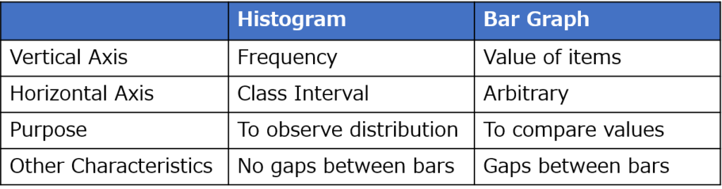
Purpose and Applications
Data Analysis
By examining the overall shape of the graph, you can visually grasp variations and biases in the data.
Criteria for Sample Selection
Focusing on individual data points allows you to understand their relative position compared to the overall distribution, helping you choose appropriate samples based on your objectives.
Threshold (Specification) Setting Criteria
By comparing data with thresholds or target values, you can assess the appropriateness of the threshold setting and the margin of safety.
What You Can Learn from a Histogram (6 Common Patterns)
Histograms can be broadly categorized into six types:
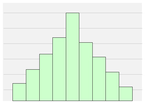
1. Normal (Bell-shaped) Type
A symmetric distribution with a peak in the center. This is commonly seen in stable processes.
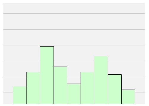
2. Bimodal Type
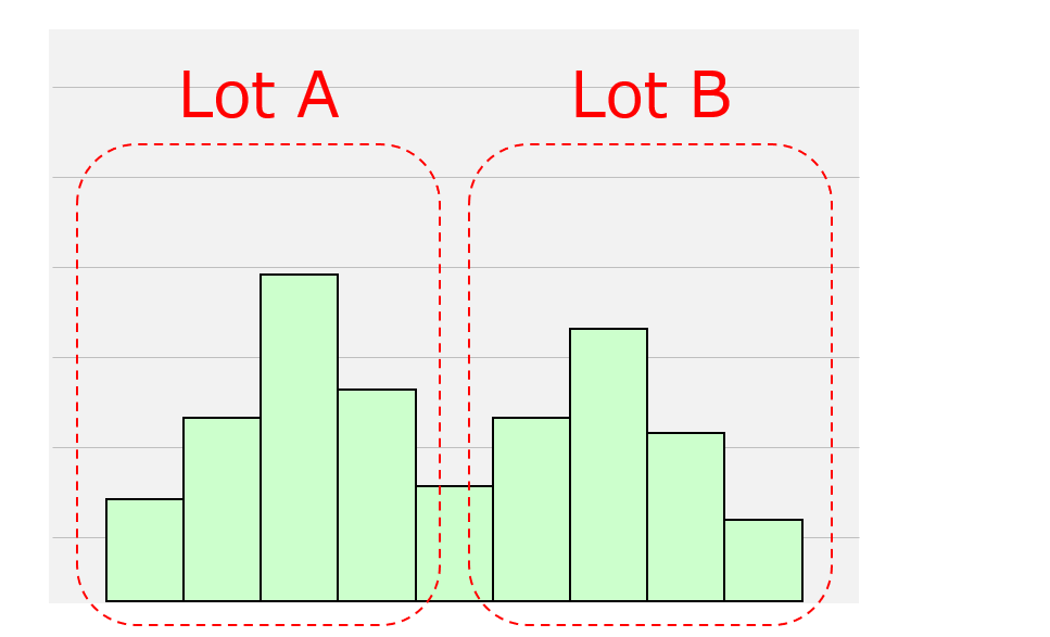
A distribution with two peaks and a lower center. This may indicate the presence of two different distributions, requiring further investigation.
For example, differences in material or component lots, operator variations, or other factors could be causing the split.
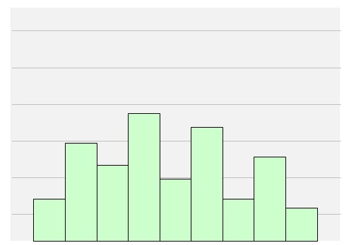
3. Gapped Type
A distribution with irregular frequency gaps. This often occurs when the interval selection is inappropriate, requiring a review of the data.
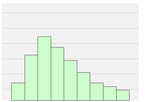
4. Skewed Type
A distribution that is heavily skewed to one side. This often happens when there is a constraint on the upper or lower limit (e.g., no data below zero).
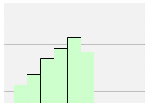
5. Cliff Type
A distribution where frequencies drop off sharply, forming a “cliff.” This typically occurs when out-of-spec data is excluded.
6. Isolated Peak Type
A distribution with a separate peak away from the main data. This suggests potential outliers due to defective products or measurement errors, requiring further analysis.
Key Points for Interpreting a Histogram
- Capture the overall distribution
- Focus on individual data points
- Analyze data in a relative manner
Capture the Overall Distribution
Refer to the six histogram types mentioned earlier to understand the data’s overall shape.
If the histogram shows a bimodal or isolated peak pattern, investigating the causes can help clarify potential issues.
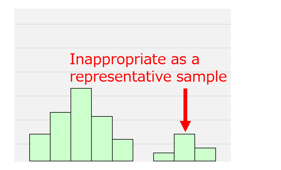
Focus on Individual Data Points
When using a histogram as a reference for sample selection, check where individual data points fall within the distribution.
For example, if choosing a representative sample, selecting an outlier is inappropriate.
Similarly, if the distribution reflects variations between lots, samples for within-lot comparisons should come from the same peak, while samples for between-lot comparisons should come from different peaks.
Analyze Data in a Relative Manner
When using a histogram to determine threshold (specification) settings, check the position of the peak relative to the set specifications.
If many data points appear to be removed due to specification limits, consider relaxing the criteria or improving the process to shift the overall distribution.
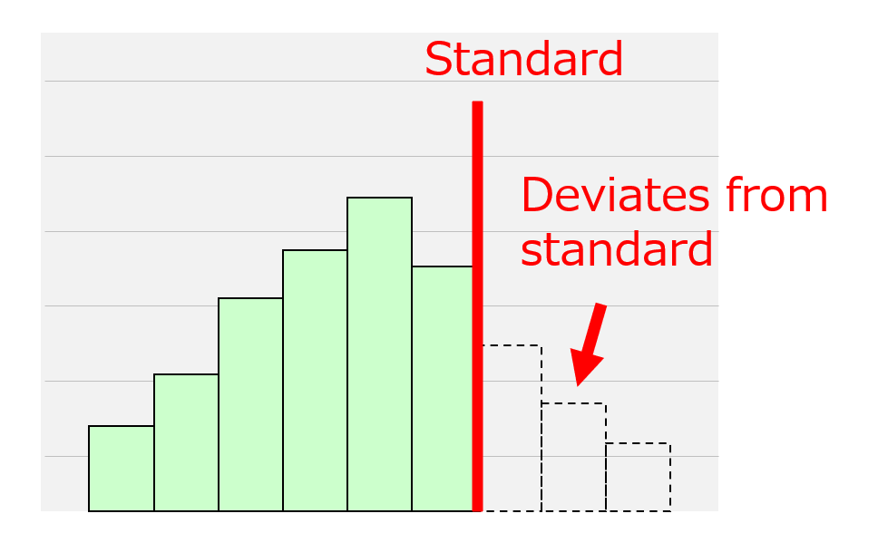
If the data shows a significant buffer within the specification range, stricter thresholds may be appropriate to eliminate outliers.
By interpreting histograms effectively, you can identify issues, assess improvement strategies, and take informed next steps.
How to Create a Histogram
For Excel 2013 and Earlier
- Determine the Class Width
- Create a Frequency Distribution Table
- Create the Histogram
Determine the Class Width
- Decide the width of the class intervals for the horizontal axis.
- You can estimate the interval width using the following formula, rounding to the nearest whole number: Max Value−Min ValueNumber of Classes\frac{\text{Max Value} – \text{Min Value}}{\text{Number of Classes}}Number of ClassesMax Value−Min Value
- There is no strict rule for the number of classes, but 5 to 8 is generally recommended.
- To calculate the optimal number of classes based on sample size, you can use Sturges’ formula:
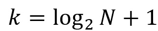
(where “k” is the number of classes and “N” is the sample size)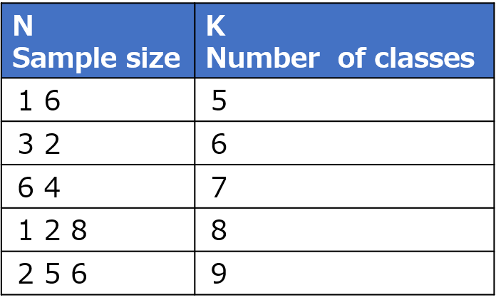
Create a Frequency Distribution Table
Count the number of data points (frequency) in each class. You can do this in two ways:
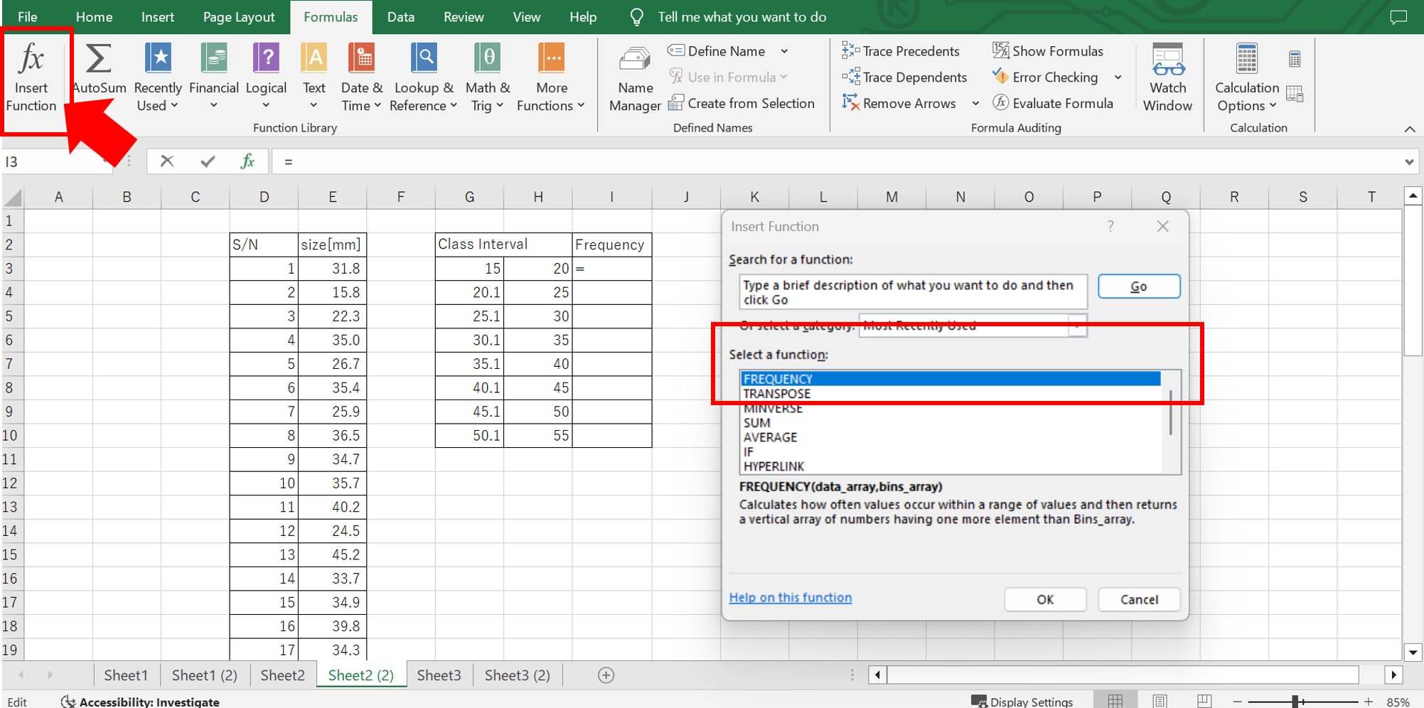
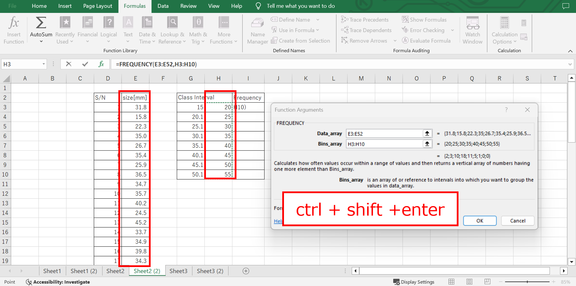
① Using the FREQUENCY Function
- Enter the class boundaries in a column beforehand.
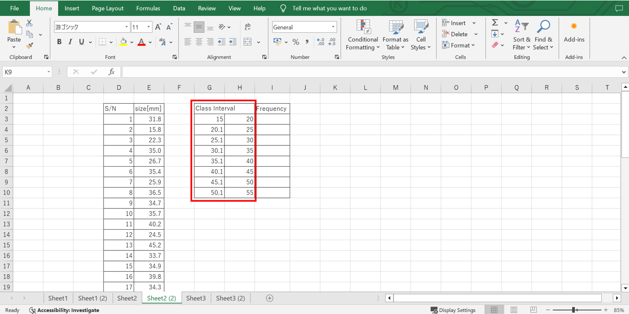
- Use the FREQUENCY function:
- “Data Array” →
Select the dataset. - “Bins Array” → Select the upper limits of each class.
- Press Ctrl + Shift + Enter to apply the function.
- “Data Array” →
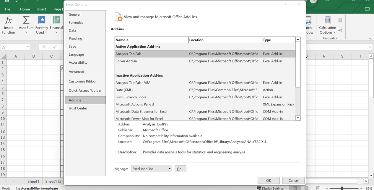
② Using Excel’s Add-in Feature
- Enable the Analysis ToolPak:
- Go to File → Options → Add-ins → Manage Excel Add-ins → Check “Analysis ToolPak” → OK.
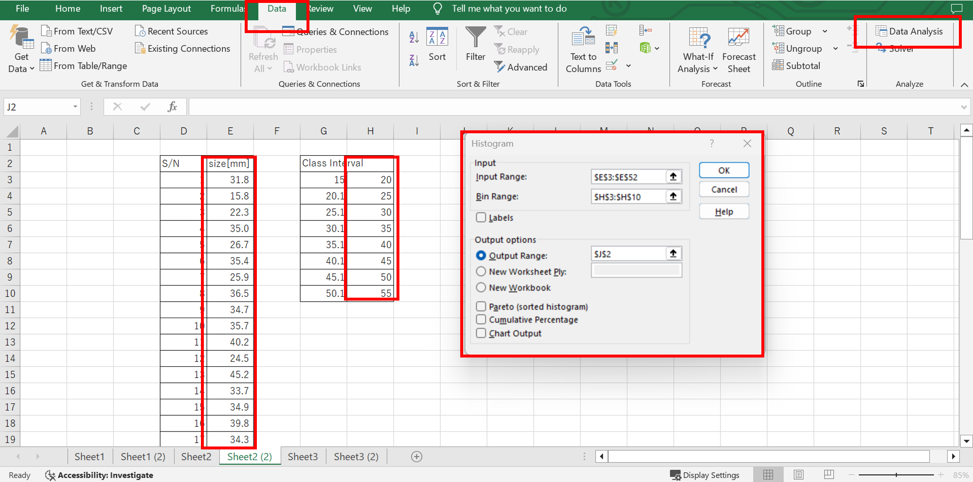
Create a frequency table: - Go to Data → Data Analysis → Histogram.
- “Input Range” → Select your dataset.
- “Bin Range” → Select class upper limits.
- Click OK to generate the table.
- Go to File → Options → Add-ins → Manage Excel Add-ins → Check “Analysis ToolPak” → OK.
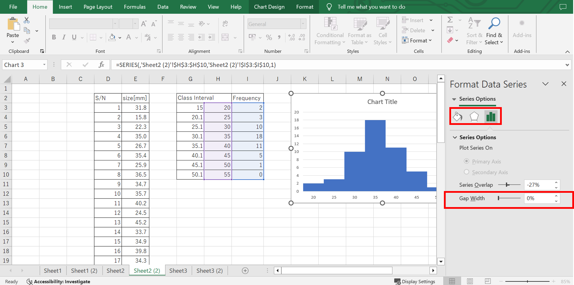
Create the Histogram
- Go to Insert, select a bar chart, and set:
- Vertical axis → Frequency
- Horizontal axis → Class boundaries

- Right-click the graph → Format Data Series →
- Set “Gap Width” to 0%
- Enable border lines
For Excel 2016 and Later
- No need for manual frequency calculations or function inputs!
- With the new Statistical Chart feature, creating a histogram is easier than ever.
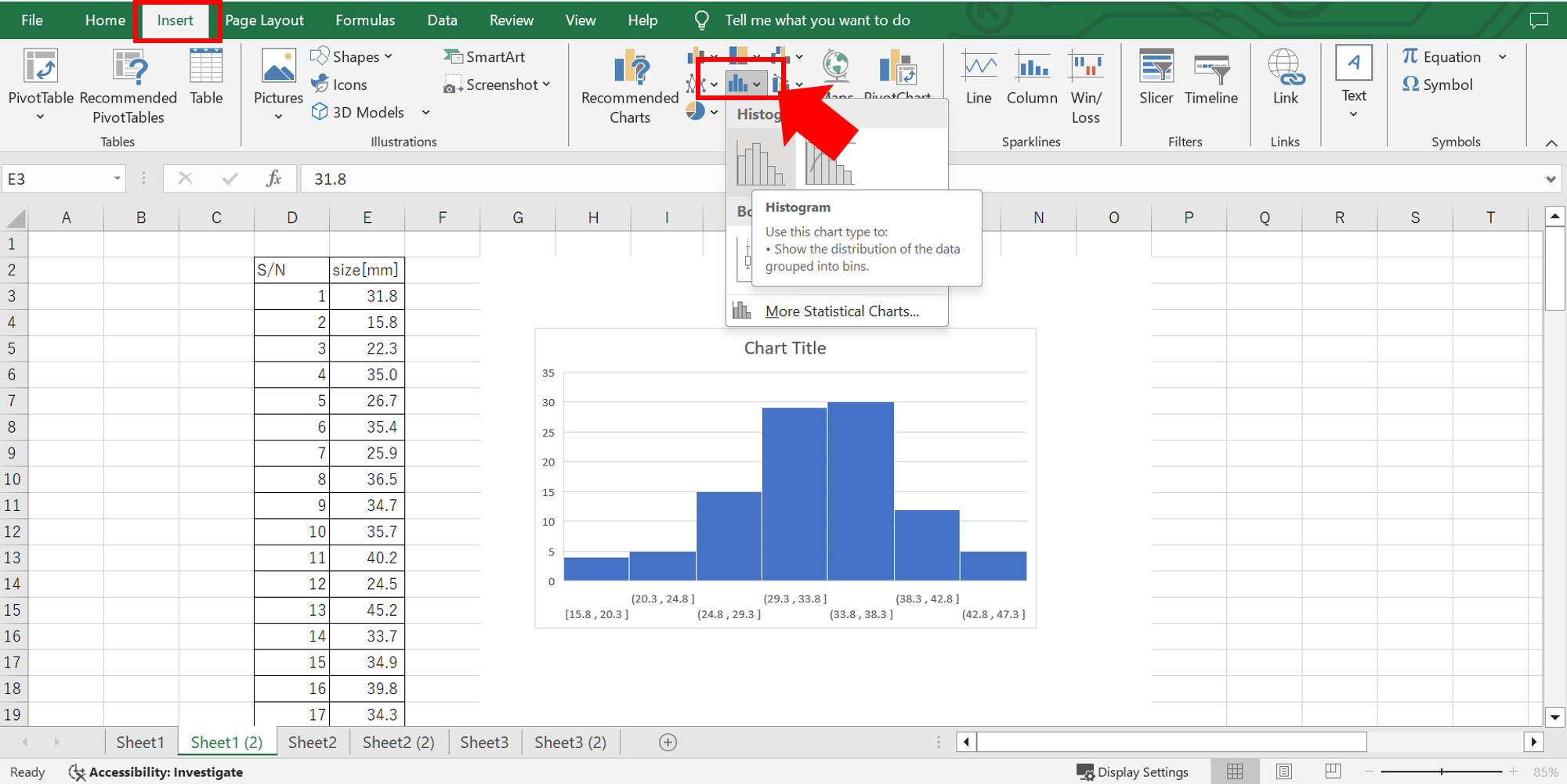
Insert a Histogram
- Select your data range.
- Go to Insert → Insert Statistical Chart → Histogram.
Adjust the Axis Settings
- Right-click the horizontal axis → Format Axis.
- Set the Bin Width and Upper/Lower Limits:
- Bin Width: 5
- Overflow Bin: 55
- Underflow Bin: 20
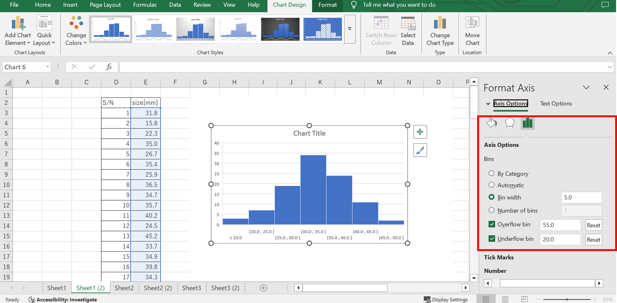
That’s it! Your histogram is ready in just one minute!

Column
Failure to Detect Suspect Products
A disconnection defect in an electrical component of a product I was responsible for went undetected and was discovered by a customer during use.
Upon receiving a complaint, I immediately reviewed the shipment inspection data. The inspection results showed that the product had passed.
At the time of shipment, there were no detectable issues. However, environmental stress and repeated use likely led to the disconnection.
It appears that the wiring was barely connected at shipment, creating a loose contact condition.
The issue was not a complete failure to detect defective products but rather an inability to identify suspect products during the process, which ultimately led to this trouble.
Two Measures for Preventing Recurrence
After much effort, we identified the root cause and took preventive action by reviewing the manufacturing process to ensure that loose contacts were not produced in the first place.
However, this alone was not sufficient—neither our customers nor our own quality assurance team would be satisfied.
This was expected, as preventing recurrence requires two measures:
- Preventing occurrence by improving manufacturing conditions.
- Preventing defective products from being shipped through enhanced inspection.
Even if we improve the manufacturing conditions, there is no absolute assurance that defective products will never appear again. If suspect products do arise, we must be able to detect them and prevent their shipment.
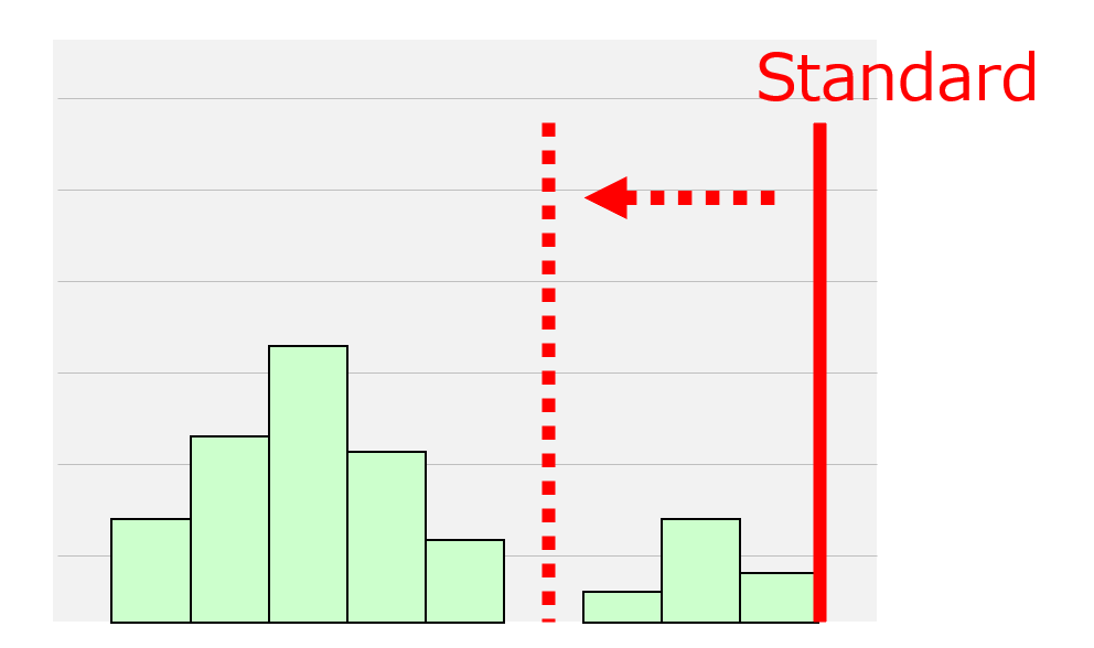
To achieve this, we examined the distribution of electrical test results to assess the validity of the threshold (specifications).

Reviewing the Specifications
As part of the continuity test, we collected and analyzed all electrical resistance measurements and found an isolated peak in the data.
A closer inspection of defective products revealed that their values deviated from the normal product distribution.
- In normal products, the continuity state was stable, and resistance values were close to zero.
- However, in defective products, the resistance values were slightly higher, indicating a loose connection.
This finding confirmed that the suspect products could be detected by analyzing the distribution.
Therefore, we revised the inspection criteria, setting a stricter threshold to detect isolated peaks and prevent defective products from being shipped.
Lessons Learned
Initially, when we set the specifications, we simply aimed to distinguish between OK and NG products and roughly determined the threshold.
However, this experience taught us that we should have carefully analyzed the data from the beginning to establish an appropriate specification.
This incident served as an important lesson in ensuring proper quality control through data-driven decision-making.
Summary
Histogram
A statistical graph with frequency on the vertical axis and class intervals on the horizontal axis.
Purpose and Applications
- Data Analysis
- Sample Selection Criteria
- Threshold (Specification) Setting
Key Points for Interpretation
- Understand the overall distribution
- Focus on individual data points
- Analyze data in a relative context
How to Create a Histogram
- For Excel 2013 and Earlier
➡ Use the FREQUENCY function or Add-in tools to create a frequency distribution table, then graph it. - For Excel 2016 and Later
➡ Use the built-in Statistical Chart feature and adjust the bin settings—quick and easy!
A must-have analysis tool for handling large datasets! Creating a histogram is simple, so give it a try!


コメント