

“What kind of graph is a Pareto Diagram?”
“I want to know how to create a combination chart in Excel.”
“Could you teach me tips for interpreting a Pareto Diagram?”
This article is for those who have such questions. It provides a clear and concise explanation that can be understood in just 10 minutes.
Pareto Diagram is an efficient tool for identifying issues in manufacturing processes, making it one of the essential tools to master.
Based on my 10+ years of experience as a process engineer, this article introduces key points for analyzing defects using a Pareto Diagram.
Additionally, to help beginners, I explain the basic structure of a Pareto Diagram and how to create combination charts in Excel. I hope you find it useful!
What is a Pareto Diagram?
Pareto Diagram is a combination graph that consists of a bar graph arranged in descending order (from largest to smallest values) and a line graph representing the cumulative percentage.
This diagram is named after the Italian economist Vilfredo Pareto, who developed the concept.
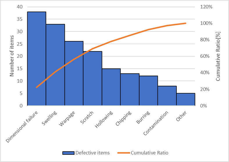
For example, the horizontal axis represents defect categories, and the vertical axis of the bar graph shows the number of defects. At first glance, it may look like a standard bar graph, but it includes an additional line graph for the cumulative percentage.
The cumulative percentage is, as the name suggests, the accumulation of the percentage composition. As you move to the right on the horizontal axis, the percentage increases, eventually reaching 100% at the far right.
Strictly speaking, the bars should be drawn without any gaps between them, and the line graph should be plotted at the top right corners of the bars according to the standard rules.
However, since adjusting the plot positions of the line graph in Excel can be cumbersome, for simplicity, this article places the line graph points at the center of each bar.
Purpose and Applications
Identifying Issues
By examining the descending bar graph, you can clearly pinpoint problematic items, making it an effective tool for visualizing issues.
Understanding Impact
The cumulative percentage allows you to determine the proportion each item contributes to the whole, helping you understand its impact.
By identifying the most significant items, you can focus your efforts effectively, making it a useful tool for implementing “selection and concentration” strategies.
Confirming Improvement Effectiveness
The Pareto Diagram is also effective for before-and-after comparisons. For instance, you can use it to analyze changes in the order or proportion of items before and after improvement activities.
As shown above, Pareto Diagram can be applied in various situations, such as planning improvement activities and evaluating their effectiveness. It’s a method worth knowing to facilitate the PDCA (Plan, Do, Check, Action) cycle.
The Pareto Principle
Vilfredo Pareto is also well known for developing the “Pareto Principle.”
The Pareto Principle states that 20% of the elements contribute to 80% of the outcomes, often referred to as the “80:20 rule.”
For example, it is frequently cited in cases such as 20% of a company’s top-performing employees generating 80% of its revenue. Beyond economics, this principle is also applied as a rule of thumb in various scenarios, including natural phenomena and social phenomena.
When applied to improvement activities in manufacturing, the principle suggests that addressing the top 20% of defects can yield 80% of the desired results. This perspective can help you drive improvement initiatives more efficiently.
Steps to Create a Pareto Diagram
- Determine the Analysis Target
- Collect Data
- Aggregate Data
- Create the Bar Graph
- Add the Line Graph
- Include Essential Details
- Determine the Analysis Target
Start by deciding on the categories for the horizontal axis and the data for the vertical axis of the bar graph.
Examples in manufacturing include:- “Defect categories and counts”
- “Defect categories and monetary losses”
- “Work processes and time spent”
- Collect Data
Decide on the period for data collection and gather data.- Ensure that the conditions for each category are as consistent as possible.
For example, when analyzing defect categories, mixing data from different operators, component lots, or equipment conditions may lead to incorrect interpretations because these variables won’t be reflected in the graph. - If mixing data from different conditions is unavoidable, confirm beforehand that these variations won’t significantly affect the analysis.
- Ensure that the conditions for each category are as consistent as possible.
- Aggregate Data
Organize the collected data: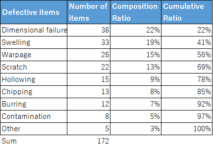
- Sort the categories by the number of occurrences in descending order.Group smaller categories into an “Others” category.Calculate the proportion of each category and the cumulative percentage, then compile these into a table.
- Create the Bar Graph
Using the aggregated data, start by plotting a bar graph based on the category counts.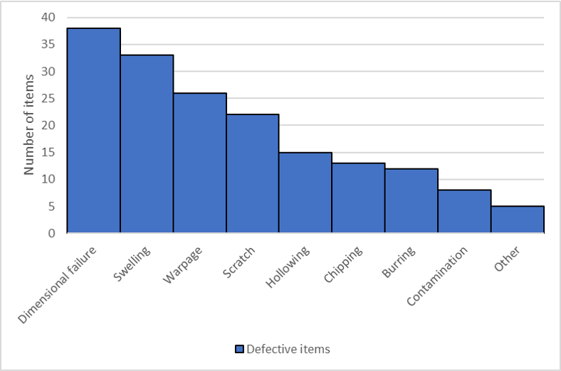
- Add the Line Graph
Add a line graph to represent the cumulative percentage.
- Use a secondary vertical axis (on the right side of the graph) to display percentages.
- Include Essential Details
To ensure the chart is understandable for others, include necessary details:- Purpose of creation
- Data collection period
- Product or process name
- Creator’s name and creation date
By following these steps, you’ll create a clear and functional Pareto chart to visualize and analyze data effectively.
How to Create a Pareto Diagram in Excel
In Excel 2016 or later, creating a combination chart is quick and easy.
- Select the Data
Highlight the data for:- Horizontal axis labels (e.g., defect categories)
- Bar graph values (e.g., counts)
- Line graph values (e.g., cumulative percentages)
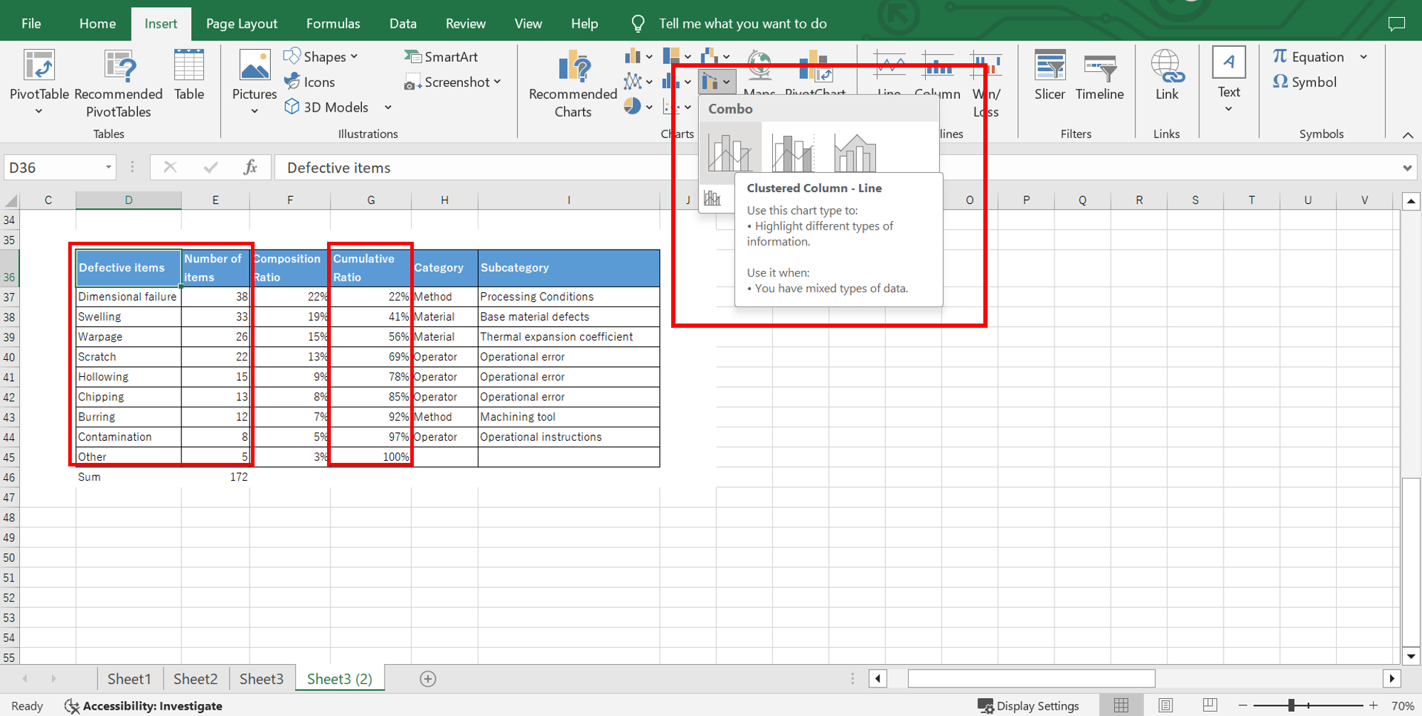
- Insert a Combination Chart
Go to:
Insert → Charts → Insert Combo Chart.With just this step, a combination chart is automatically created.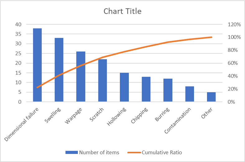
- Adjust the Secondary Axis
By default, both the bar graph and line graph share the same vertical axis, which can make the chart hard to read. To fix this:- Right-click the line graph series.
- Select Format Data Series → Secondary Axis.
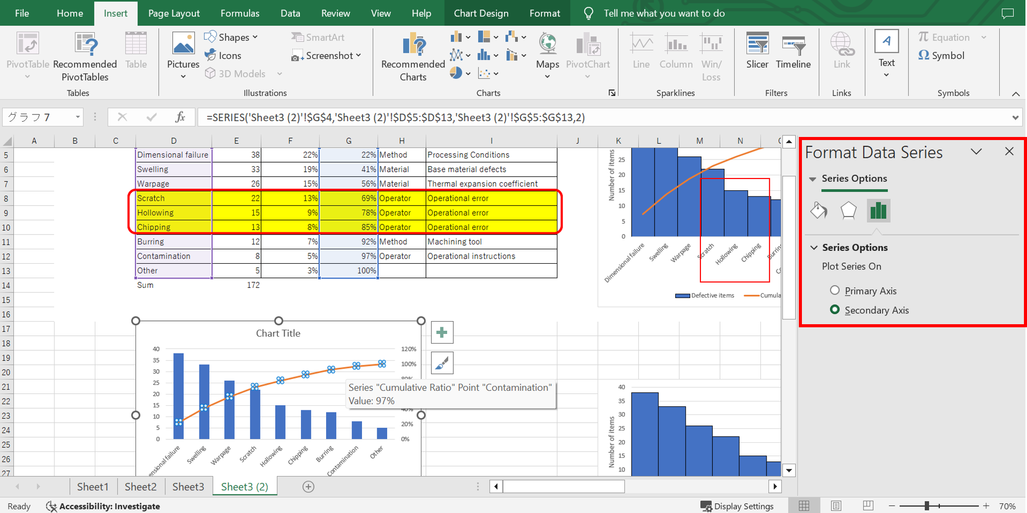
- Fine-Tune the Chart
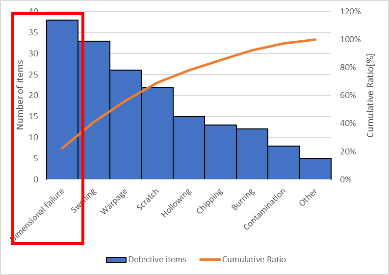
- Set the bar spacing to zero (remove gaps between bars).
- Add axis labels to clarify the purpose of both vertical axes.
After completing these steps, you’ll have a clear and functional Pareto Diagram ready to use.

Insights Gained from a Pareto Diagram
Key Points for Interpretation:
- Focus on the Most Significant Factor
- Group Causes Broadly and Focus on Ratios
- Identify Common Root Causes
1. Focus on the Most Significant Factor
Start by looking at the bar graph to identify the most significant factor (the leftmost item).
This factor represents the largest number of occurrences and should immediately be recognized as the primary issue.
2. Group Causes Broadly and Focus on Ratios
Next, try categorizing items into broader groups.
For example, grouping by the 4M factors—Man, Machine, Material, and Method—can often reveal meaningful relationships.
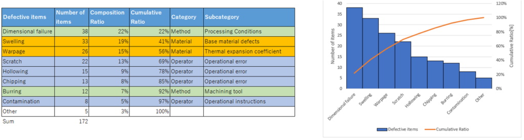
Example Scenario:
The most frequent defect type is “Dimensional failure.”
When categorized by the 4M framework, most defects are found to be related to “Material.”
This suggests that “Material” is a weak point in this process, and focusing long-term improvement efforts on materials would be a strategic approach.
3. Identify Common Root Causes
Delve deeper by grouping items based on their root causes.
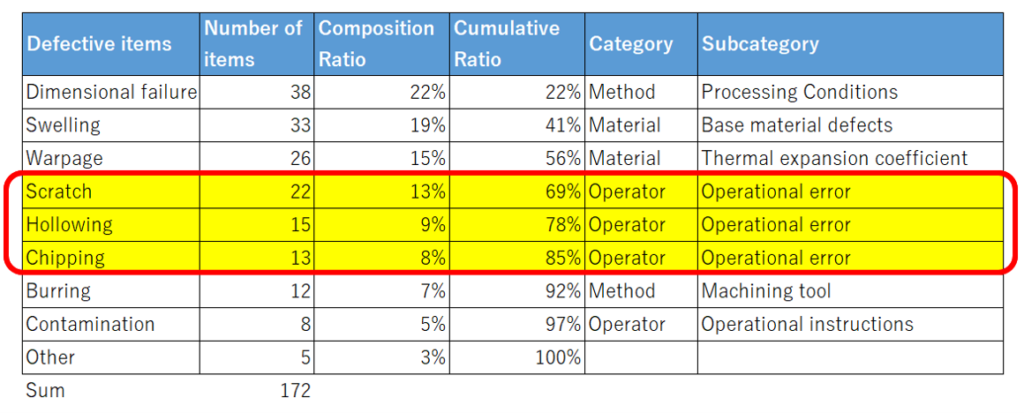

Example Scenario:
A significant portion of defects is linked to operational errors.
In this case, “operator training” becomes the most urgent priority.
The way items are categorized affects the identification of priority issues. While focusing on the most frequent factor is important, analyzing from different angles—such as root causes or broad categories—helps pinpoint the most actionable areas for improvement.
By aligning your analysis with specific goals and issues, you can clearly define the next steps and drive meaningful process improvements.
Column
The Battle Against Defects
I once faced the challenge of improving the yield rate on a particular production line. The project leader set a daunting goal: achieve a 99% yield rate within a year. At the time, the yield was a dismal 80%—a long way from the target.
To show results quickly, I turned to the Pareto Diagram, addressing the largest issues in descending order of significance.
Insights Gained Along the Way
Interestingly, the top three defect categories didn’t require much analysis—they were so frequent that they were burned into everyone’s memory. The Pareto Diagram’s real value lay in analyzing the other defects.
By identifying categories with shared root causes, I was able to group and address them together. For instance:
- Defects that stemmed from inconsistent operator training were tackled by standardizing work procedures.
- Once the root cause was addressed, those defects were eliminated entirely.
This prioritization helped us focus our efforts more effectively.
A Challenging Target
The production line in question consisted of over ten processes. To achieve an overall yield of 99%, each process needed an individual yield rate of approximately 99.9%. This made the task extraordinarily difficult.
Perseverance and Results
Using the Pareto Diagram, we identified high-priority items, analyzed root causes, and implemented targeted improvements. Once the largest issues were resolved, we moved on to the next in line, continuing this iterative process.
Although we slightly exceeded the one-year timeframe, we ultimately achieved the 99% yield rate target.
It was a victory earned through persistence and daily efforts to tackle defects one by one—a true testament to the power of continuous improvement.

Summary
What is a Pareto Diagram?
- A composite graph consisting of a bar graph arranged in descending order and a line graph representing cumulative percentages.
Purpose and Applications
- Identifying Problems: Pinpoint key issues effectively.
- Understanding Impact: Assess the relative significance of factors.
- Verifying Improvement Effects: Compare conditions before and after improvements.
Key Points for Interpretation
- Focus on the Most Significant Factor: Start with the largest bar (most frequent issue).
- Group Causes Broadly and Focus on Ratios: Categorize factors (e.g., by 4M: Man, Machine, Material, Method) to uncover patterns.
- Identify Common Root Causes: Combine items with shared underlying issues to prioritize improvements effectively.
Maximizing Effectiveness
How you group and analyze data can significantly enhance the effectiveness of your efforts.
A Pareto Diagram is an essential tool for running the PDCA cycle (Plan, Do, Check, Action) in workplace improvement activities. Give it a try and unlock its full potential!


コメント