“What is a control chart?”
“What types are there, and how do I choose the right one?”
“I want to spot signs of abnormalities!”
This article is for anyone with these questions. In just 10 minutes, we’ll provide a clear and concise explanation to help you understand:
- How to choose the right control chart for your purpose
- How to create a control chart
- How to identify signs of abnormalities
By the end, you’ll have a solid grasp of these concepts. Let’s dive in and make the most of this guide!
What is a control chart?
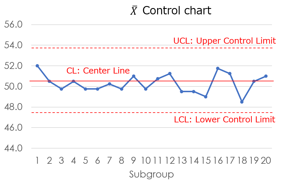
A control chart is a diagram consisting of line graphs of quality characteristic data, center lines, and control limits.
And it is used to analyze variability for the purpose of checking the stability of a productions.
Statistical variability is caused by following two factors.
Common cause
Due to unavoidable causes that occur even when the process is under good conditions. For example, slight differences in the surface condition of the material, slight differences in the assembly of the equipment.
Special cause
Due to an accidental cause. For example, operators disregard rules, materials are out of specification.
This concept was proposed by the American economist Shewhart and devised as an analytical tool to find the causes of abnormality.
The control chart consists of the following.
Purpose of using control charts
Purpose
To check the stability of the process
You can check the stability of the process by inspecting the relative position to the center line or control limit line.
To maintain a stable process
You can find signs of abnormality from the indicators in the control chart. Therefore, it is effective as a guideline for taking preventive and post-maintenance measures to return the system to an optimal state.
What types of products are available?
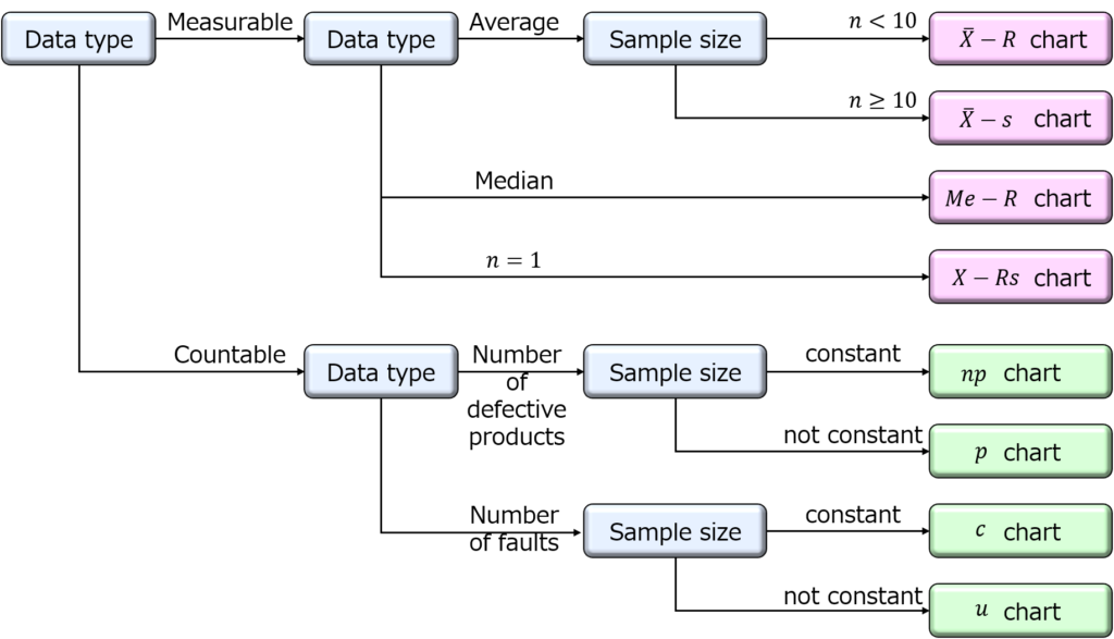
There are several types of control charts, and the appropriate one must be chosen according to the form of the data.
Measurable data or Countable data
Measurable data
It can be measured and weighed. Continuously changing values such as temperature, length, and time.
Countable data
It can be counted as a number. Discrete variable values such as number of pieces, number of cases, or number of people.
Control charts are classified according to the data type, as follows.
Characteristics of control chart
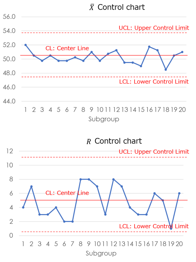
The following graph is a typical example of a $\bar{X}-R$ control chart.
The first line graph is showing the average value. And the second graph is showing the range.

The horizontal axis of the graph shows the subgroup number. For example, subgroups are organized by product lot or production date.
The center line represents the average of the total data. The center line is generally drawn as a solid line.
The dotted lines above and below the center line show the control limit lines.
In the range of plus or minus 3 sigma from the center line, and if the data exceeds this range, you consider it an anomaly.
How to make a control chart
The process of creation is essentially the same for all types, so we will use a $\bar{X}-R$ control chart as an example to explain the steps.
Process
1. Calculate $\bar{X}$
First, calculate the average value for each group. In the example below, when the group number is 1, the average is calculated using the four data points $x_{1}$ through $x_{4}$.
$(50+54+54+50)/4=52$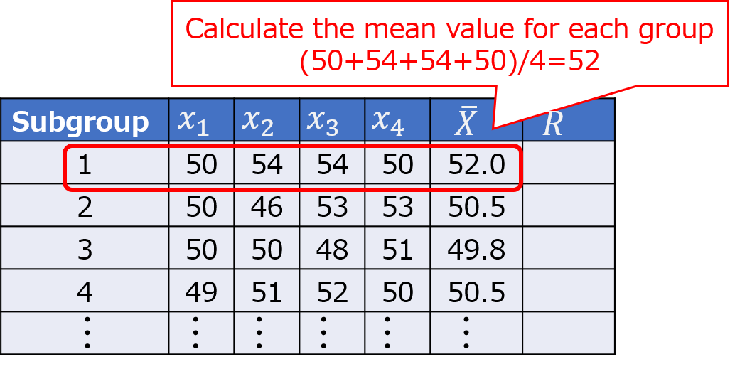
Similarly, repeat the calculation for the remaining groups.
2. Calculate $R$
Next, calculate the range for each group by subtracting the minimum value from the maximum value. For group number 1, the range is 4, obtained by subtracting the minimum value from the maximum value.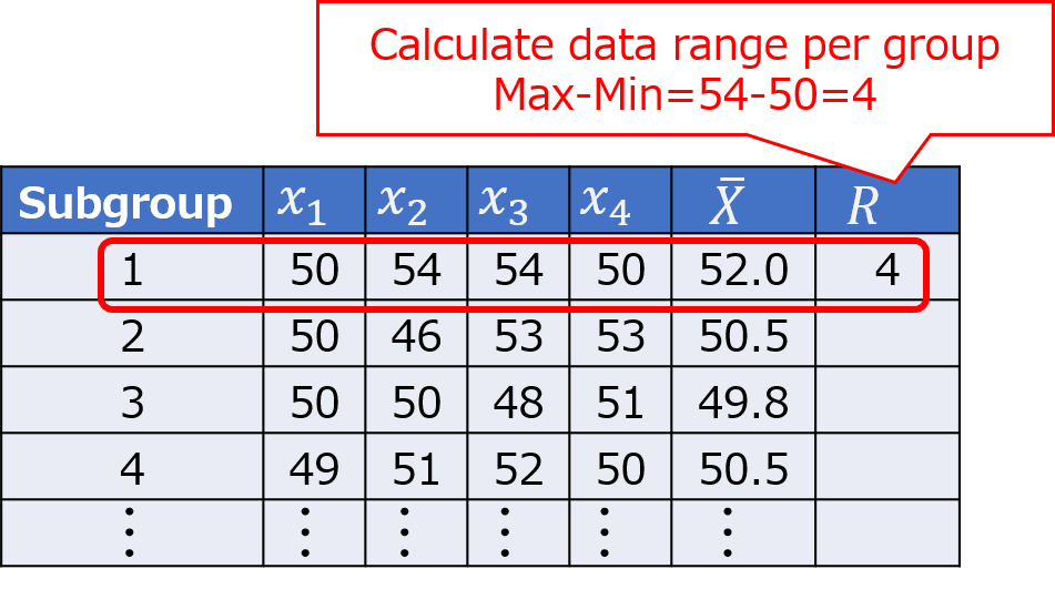
Similarly, repeat the calculation for the remaining groups.
3. Calculate $CL$
Calculate the overall average of $\bar{X}$ and $R$. This value will serve as the center line.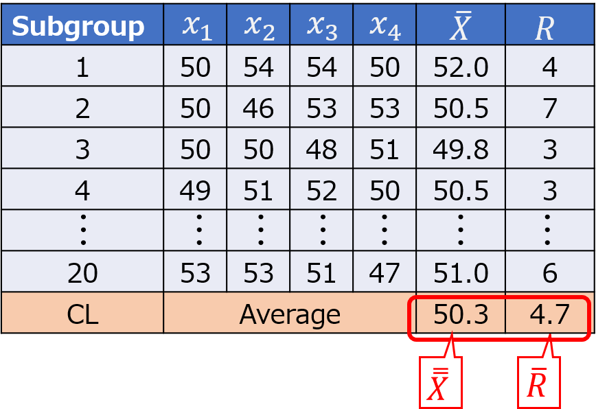
For example, when recording daily production management data, the daily measurement results are continually updated, causing the value of $CL$ to change constantly. Similarly, the value of $R$ also fluctuates over time.
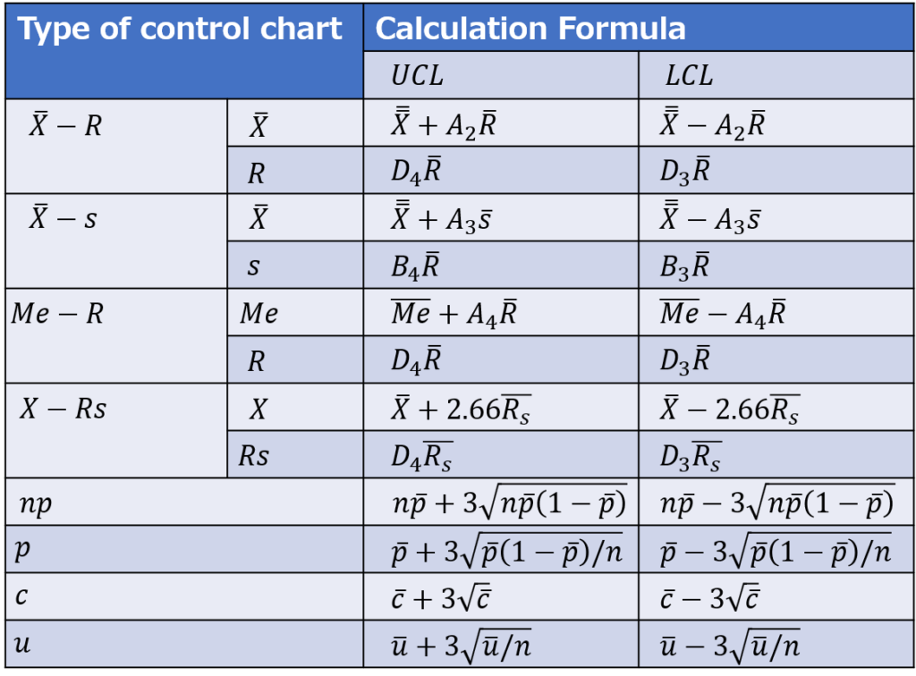
4. Calculate $UCL$、$LCL$
[$\bar{X}$]

[$R$]

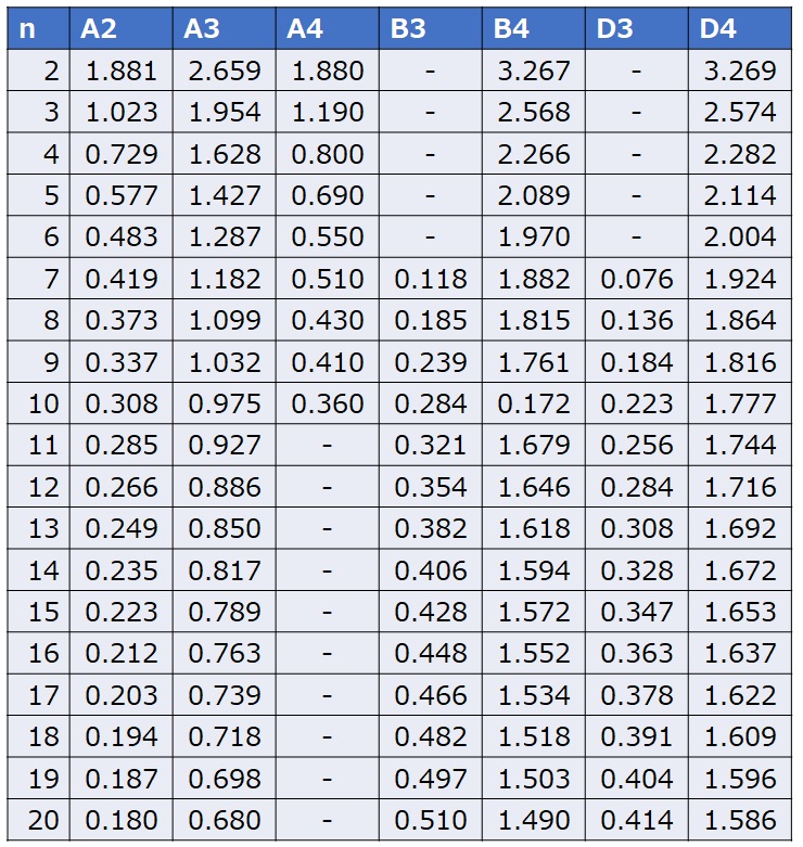
The coefficients A2, D3, and D4 are determined using the following coefficient table for control charts. While A2 uses the same coefficient for both the upper and lower limits, note that D3 and D4 require different values for the upper and lower limits.
In particular, if the sample size is 6 or less, the D3 value is not defined, meaning there will be no value for the lower control limit (LCL). This is because the range value cannot be less than zero, making it unnecessary to set a control limit below this threshold.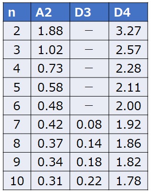
[$\bar{X}$]
$UCL=50.3+0.73×4.7=53.731$
$LCL=50.3-0.73×4.7=46.869$
[$R$]
$UCL=2.28×4.7=10.716$
5. Draw $\bar{X}$ control chart
Plot the group numbers on the horizontal axis and the average values on the vertical axis, representing them as a line graph.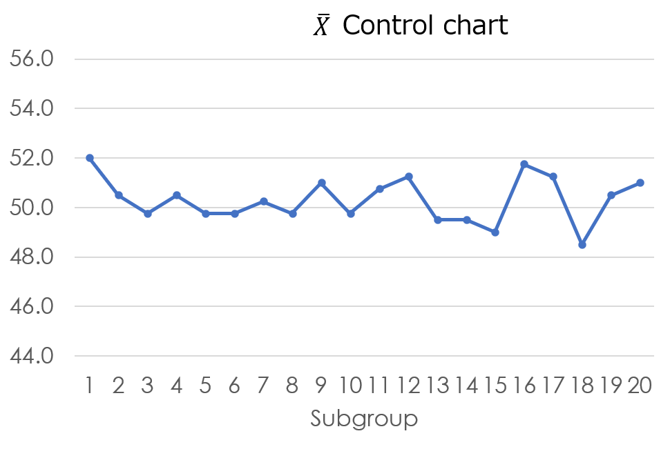
Finally, add a reference line with a clear color scheme, and the chart will be complete.
6. Draw $R$ control chart
As before, plot the group numbers on the horizontal axis and the data range on the vertical axis, representing them as a line graph.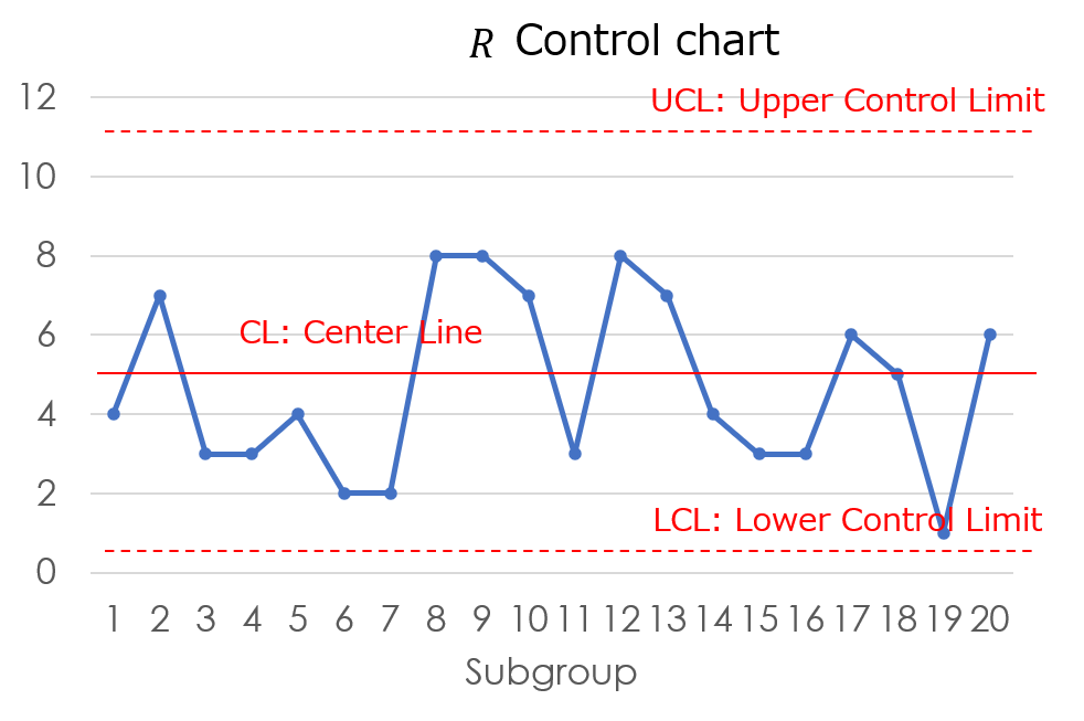
By placing the two graphs side by side, the $\bar{X}-R$ control chart is complete.
(Tips)
The UCL (Upper Control Limit) and LCL (Lower Control Limit) can be calculated using three times the standard deviation (3σ), and the results are generally close to those derived from the coefficient table.
When control charts were first devised, computers were not widely available, and calculating the standard deviation was a challenging task. However, nowadays, it can be easily computed using Excel functions.
By the way, the limit values calculated using ±3σ are as follows, and they are very close to the values obtained from the coefficient table.
$UCL= 53.0$(In the calculation of the coefficient values, the result is 53.7.)
$LCL= 47.6$(In the calculation of the coefficient values, the result is 46.9.)
When using a computer, it’s convenient to use the 3σ value, while for manual calculations on the production floor, it’s better to use the coefficient values. It’s important to choose the appropriate method depending on the situation.
Below are the formulas and coefficient values when using the coefficient table for calculations.
Let’s identify signs of anomalies
8 common cases for abnormality detection
The UCL (Upper Control Limit) and LCL (Lower Control Limit) are divided into 6 intervals of 1σ each, and the following rules are commonly used to identify abnormal patterns within these intervals.
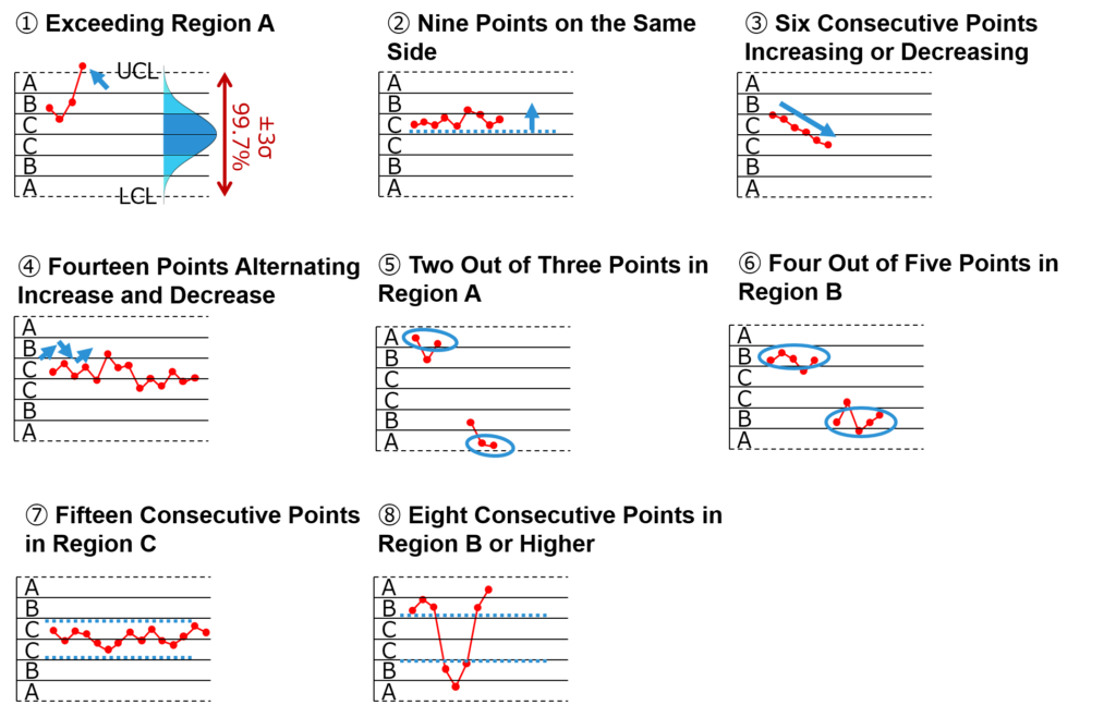
The common theme among all these points is the focus on rare probabilistic events when they occur.
Let’s take a look at some distinctive features:
[Rule 1] Exceeding Region A
The probability of staying within three standard deviations (3σ) is 99.7%. Therefore, falling outside this range may indicate some form of anomaly.
If such a trend is observed even once, it qualifies as a rare probabilistic event, so it is recommended to halt the process and check the current state.
Incidentally, as will be explained later in the section on two types of errors, the fact that the probability is 99.7% also means that the remaining 0.3% can occur even under normal conditions. This implies that there may be cases where a truly rare event just happens by chance.
[Rule 2] Nine Points on the Same Side
When nine consecutive points align in this way, it may indicate anomalies such as a shift in the mean.
Although the process may appear stable and problem-free at first glance, a streak of about five points on one side is not statistically rare. However, a streak of nine points qualifies as a rare case.
As I will mention later in my personal anecdotes, there have been instances where I was misled by this mode and overlooked a problem, thinking there was no issue. Be mindful of this.
[Rule 3] Six Consecutive Increases or Decreases
This pattern indicates a visible trend, suggesting the need for a causal analysis.
While a few consecutive points might be acceptable, a streak of six points could imply the influence of an unseen factor.
[Rule 4] Fourteen Alternating Increases and Decreases
When continuous alternations between increases and decreases occur, it may suggest some regularity or periodicity, warranting further analysis.
While this is not necessarily deemed abnormal, the persistence of this pattern over time could hint at underlying trends.
For instance, it might be beneficial to investigate factors that create regular patterns, such as changes in product quality due to workers’ shifts.
The advantage of control charts lies in their ability to reveal trends over a timeline. They can flag abnormalities when deviations from prior trends occur or when gradual deviations begin to emerge.
When encountering events with improbably low frequency, it is essential to consider that the underlying conditions may have shifted, making certain outcomes more likely.
By staying vigilant about trends observed in the data and preparing in advance, we can respond promptly to any signs that emerge. Establishing such a framework is crucial for proactive management.
Beware of Two Types of Errors
When using control charts, it’s important to understand the following two types of errors.
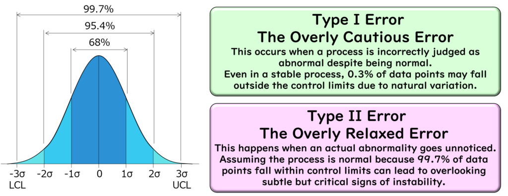
Type I Error (The “Overreacting” Error)
This occurs when a non-abnormal state is mistakenly judged as abnormal.
As mentioned earlier, the probability of falling within 3σ is 99.7%, meaning that the process will generally remain within the control limits. However, the remaining 0.3% represents the likelihood of falling outside these limits.
In other words, even when the process is under proper control, it is theoretically possible for data points to fall outside the control limits with a probability of 0.3%. This should be kept in mind.
Type II Error (The “Overlooking” Error)
This occurs when an actual abnormal state is missed.
Even if the process is unstable, a simplistic judgment that “it’s within the control limits, so everything must be fine” can lead to oversights.
While being overly cautious might result in unnecessary concern, overlooking abnormalities can lead to significant issues later if left unaddressed. Therefore, always pay close attention to any changes or trends in the data.
By understanding these errors, you can use control charts more effectively to monitor and manage processes accurately.
Column
Rare Trouble without Frequent Occurrence
Let me share a lesson I learned from using control charts.
At a certain processing facility, we occasionally noticed defects appearing sporadically.
It wasn’t a critical situation where defects occurred in large volumes, halting production. However, a casual remark from a field operator, “Lately, it feels like there are more defects than usual,” triggered an investigation.
Since the defects weren’t occurring frequently, pinpointing the cause took significant time.
Defects didn’t occur at a consistent rate every day, and it was only when looking at long-term trends that we got a faint sense of an increasing pattern. Even grasping the situation proved challenging.
In hopes of finding some clues, I turned to the operational records maintained at the site and began analyzing the data using a control chart.
Pointless routine
Reviewing the load measurement records during product processing, I found no instances where the load exceeded the defined acceptable range. However, there was a hint hidden in the trend:
At a certain point, the mean value began to shift slightly upward.
This shift became the starting point for an accelerated investigation, ultimately revealing that wear from aging of the processing tools caused the measured load to trend higher than the intended setting.
While the shift in the measured values didn’t immediately result in defects, a combination of factors such as material lot variations and operator differences occasionally caused the values to exceed the specifications.
Although it was good that records were meticulously kept, the issue lay in the fact that record-keeping had become a pointless routine. Simply recording the data as a matter of policy without analyzing trends or using the data to improve the process defeats the purpose of management.

Narrowing Down the Impact Scope
Identifying the cause didn’t mean the issue was resolved with tool maintenance.
By combining information from the control chart with maintenance records, we pinpointed the period during which the worn-out tools were used. This allowed us to determine the range of potentially impacted products.
Although products manufactured during that period weren’t defective, they had a higher chance of causing defects in subsequent processes. To address this, we communicated with the downstream processes, flagged the suspect product lots, increased sampling inspections, and closely monitored the situation.
Thankfully, the issue didn’t escalate into a major problem. However, it served as a reminder that unexpected pitfalls could lurk in the process. I resolved to remain vigilant to trend changes, never assuming that “keeping records is enough.”
Summary
Control Charts
A graph composed of a line chart with a center line, UCL (Upper Control Limit), and LCL (Lower Control Limit), used as an analytical tool to maintain processes free from abnormal causes.
Purpose & Application
Check process stability
Maintain control of stable processes
Types of Control Charts
Classified into variables and attributes depending on the nature and characteristics of the data.
Identifying Abnormalities
Eight rules exist for identifying abnormalities.
Pay attention to the two types of errors (Type I and Type II).
Choose a control chart suitable for your purpose, enhance the sensitivity of abnormality detection, and ensure you don’t miss the signals emitted by the control chart.
Thank you for reading to the end!

